In this article, we will devise some tools that help us diagnose problems with the communication system under study. I like to call them the stethoscopes for a communication system due to the crucial functionality they provide regarding the health of the communication system being analyzed. We discuss three such tools, namely an eye diagram, a transition diagram and a scatter plot below.
Eye Diagram
An eye diagram is an excellent summary of the signal behaviour in time domain, something analogous to a spectrum in frequency domain. Imagine the samples of the matched filter output taken at a much higher rate, say $L=64$ samples/symbol, instead of $L=2$ samples/symbol so that the underlying plot looks continuous as in Figure below.
Next, the waveform is divided into black boxes of width $T_M$ seconds such that each signal portion within a box starts half a symbol duration $T_M/2$ before the ideal sampling time $iT_M$, where $i$ is an integer. Similarly, each signal portion within a box ends at half a symbol duration $T_M/2$ after the ideal sampling time $iT_M$.
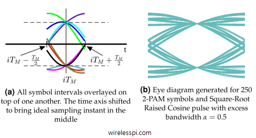
Assume that such a stream of PAM symbols is printed on a paper and all black boxes are cut into separate pieces precisely at symbol boundaries. My daughter just did that when I gave her a printed PAM sequence, as shown in Figure below.
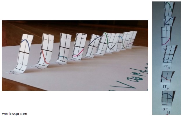
Now if they are placed on top of one another, we get a diagram drawn in Figure below. This is eye diagram, which is a modulo-$T_M$ plot of matched filter output against time. Compare the color patterns between both figures and observe that time base in Figure below is shifted such that optimum sampling instant occurs in the middle of the plot. This shift in time base can sometimes cause confusion and hence it should be remembered that although the ideal sampling instants actually occur at the end of a symbol interval, an eye diagram shows that instant in the middle.

Therefore, it can be concluded in general that an eye diagram draws an overlapping symbol waveform within an interval
\begin{equation*}
-0.5T_M \le t \le +0.5T_M
\end{equation*}
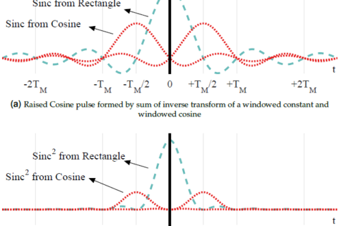
Also note that the eventual pattern strongly depends on the underlying pulse auto-correlation from which the pulse shape for transmitting data is derived. Now remember that we are only using an example of a $2$-PAM modulation with $10$ bits, and hence $10$ symbols, only. When a large number of symbols are generated for such a plot and overlaid on each other, all possible trajectories of the pulse auto-correlation dictated by the symbol sequence come into play. A diagram for Square-Root Raised Cosine pulse shape (and hence Raised Cosine pulse auto-correlation) generated for $250$ symbols and excess bandwidth $\alpha=0.5$ is shown on the right in Figure above. Notice that this plot resembles a human eye, hence the name eye diagram.
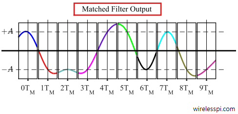
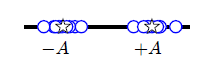
Interestingly, tracing a single transition in an eye diagram gives information about $3$ symbols. As an example, look at the trace around $5T_M$ on the left in Figure above:
[NOW] Observe that the trace goes through $+A$ at the current sampling instant.
[Past] Also, it starts from a high voltage level. That is an indicator that in a clean system, its previous symbol would have been $+A$. Now compare it with the matched filter output for PAM stream and it is verified that its previous symbol, the purple trace, is indeed $+A$.
[Future] Finally, its level is falling below zero and towards $-A$ which indicates that the next symbol should be $-A$. The fact that the black trace in matched filter output for PAM stream is $-A$ verifies this observation.
This will help us when we discuss symbol timing synchronization.
Eye diagram is a diagnostic tool that helps in evaluation of the effects of channel noise and Inter-Symbol Interference (ISI) on the performance of a communication system. For this purpose, an eye diagram for a real transmission system can be generated through an oscilloscope. The horizontal time base of the oscilloscope is set equal to a symbol interval $T_M$ and the matched filtered sequence is connected to the vertical axis. This superimposes the symbol intervals into a family of traces, all displayed within the same duration. The persistence of oscilloscope display makes it look like an eye.
To see how it helps, consider Figure below that consists of two symbol durations. Relevant information that can be extracted from an eye diagram is detailed below.
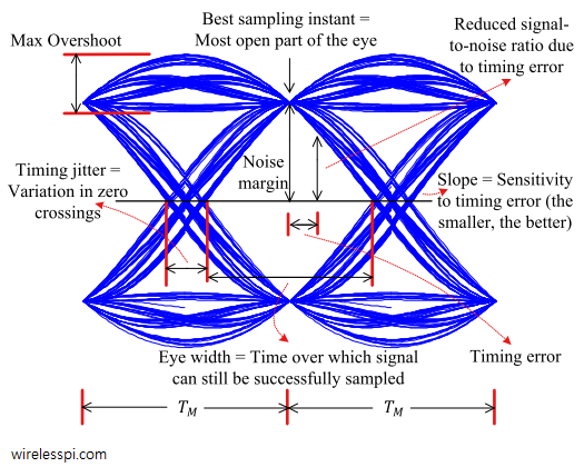
[Best Sampling Instant:] For Nyquist pulses, no ISI occurs at the end of a symbol duration $T_M$ — which falls in the center of the eye. This gives the maximum possible SNR on average because the sample value is farthest from the decision threshold at this point. A wrong decision will only happen if the noise is sufficient to move the sample towards the other side of this threshold.
[Timing Error:] A timing error occurs when the eye is not sampled at maximum average opening. For a data waveform, it means that the ideal sample is not at the peak of the auto-correlation and hence the timing instant is either early or late.
[Noise Margin:] If a timing error occurs, the signal is sampled closer to the decision boundary. A relatively smaller amount of noise can cause a decision error. Or in other words, noise margin gets reduced (for some trajectories, a timing error actually improves the noise margin, while for many others, it reduces that margin; when the average of all trajectories is taken into account, the noise margin decreases proportionally to the timing error).
[Timing Jitter:] Timing jitter is a measure of average deviation around the mean zero crossings. In the old days, it was not much of a problem due to low symbol rates. Modern high speed communication systems have an increasingly shorter symbol time $T_M$. Since the timing jitter originates from the actual device circuitry, it becomes increasingly larger as a percentage of this symbol period.
[Eye Width:] The wider the eye, the cleaner the channel. Channel distortion decreases the eye width and also decreases the eye opening at the best sampling instant. An open eye pattern corresponds to minimal signal distortion. Many wireless channels cause the eye to close}}: there remains no sampling instant where a best symbol estimate can be obtained.
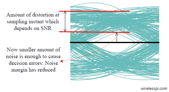
In fact, the eye in Figure above looks so symmetric because it is drawn for a noiseless case. Even for an AWGN channel with a low SNR, the eye can close but will remain symmetric in general as illustrated in Figure below. Depending on the SNR, there is distortion at the best sampling instant as opposed to the previous case. Moreover, noise margin gets reduced, as a consequence of which decision errors can occur for relatively smaller noise power.
[Slope:] Slope of the eye determines its sensitivity to timing errors. A large slope implies that even a little deviation in the timing instant can cause the sample value — and subsequently noise margin — to reduce significantly. Therefore, a smaller slope lessens the effect of this dependence.
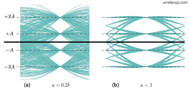
Eye diagrams can also be drawn for modulation schemes packing multiple bits in one symbol. For the case $M=4$, due to the presence of more than $2$ symbols, the next symbol after every particular symbol can be $+3A$, $+A$, $-A$ or $-3A$ resulting into many different trajectories. Therefore, an eye diagram for modulation order $M>2$ displays multiple eyes, an example of which is illustrated in Figure below. Also notice that the larger the excess bandwidth $\alpha$, the lesser the interference among adjacent symbols in time and the eye is more open.
The eye diagrams studied before consist of a $1$-dimensional modulation scheme, namely PAM. On the other hand, a QAM signal consists of two PAM signals riding on orthogonal carriers. At baseband, these two PAM signals appear as $I$ and $Q$ components of a complex signal at the Tx and Rx. Therefore, there are two eye diagrams for a QAM modulated signal, one for $I$ and the other for $Q$ and both of them are exactly the same as PAM.
Transition Diagram (Phase Trajectory)
We discussed above that in the case of QAM transmission, the matched filter output is complex valued and hence two eye diagrams are needed, one is the modulo-$T_M$ plot of the inphase component and the other is the modulo-$T_M$ plot of the quadrature component. Instead of drawing the $I$ and $Q$ parts in separate diagrams, another alternative that displays the relationship between $Q$ versus $I$ is a transition diagram or a phase trajectory plot. A transition diagram is just a 2D diagram depicting the continuous-time $Q$ vs $I$ signal in the complex plane itself without any time axis.
Some examples of the transition diagrams for a $4$-QAM and a $16$-QAM modulation schemes are drawn in Figure below for a Raised Cosine pulse with excess bandwidth $\alpha=0.5$ and $\alpha=1$ for zero noise. Some observations are as follows.
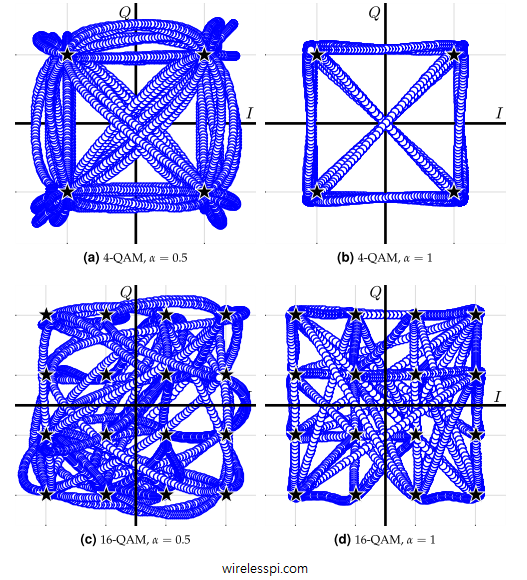
- The angle of the plot with respect to $I$-axis is the instantaneous phase of the QAM modulated signal (without any carrier).
- There is no explicit time axis in this plot but it can be traced from the plot moving from one constellation point to another.
- We can easily identify the underlying constellation points from the phase trajectory.
- A higher excess bandwidth, e.g., $\alpha=1$, prevents any substantial overshoots from appearing when the signal transitions from one constellation point to another. This makes sense because in a time domain plot, a higher excess bandwidth gives rise to smooth transitions between symbols (very similar to an unmodulated sinusoid).
Scatter Plot
In general, a scatter plot is a graph that shows the relationship between two sets of data. More specifically, a scatter plot of a complex signal is a plot of its $Q$ samples drawn versus its $I$ samples. For the purpose of digital communications, a scatter plot can be explained as follows.
Remember that we used a continuous version of the matched filter output to understand the eye diagrams and the transition diagrams. For scatter plot, we will use the matched filter output downsampled at $1$ sample/symbol as a reference. After downsampling the matched filter output to symbol rate, the samples thus obtained are mapped back to the constellation. Before the symbol decisions are made, those samples form a cloud around the ideal constellation points as shown in Figure below. This cloud of symbol-spaced samples mapped on the original constellation diagram is called a scatter plot.
For a QAM modulation, this cloud of samples around the constellation points is now $2$-dimensional (for PAM, there was no $Q$ component) and can also be understood as a plot of $Q$ versus $I$ for each mapped value, i.e., a downsampled version of the transition diagram. This is illustrated in Figure below.
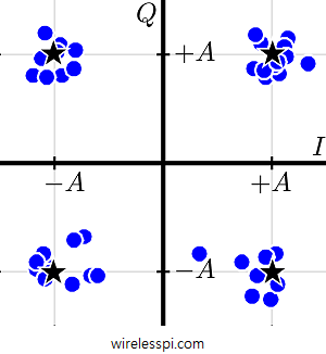
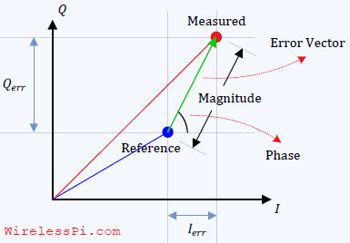
Looking at the scatter plot, one can readily deduce a lot of performance measures for the particular transmission system. One such measure widely used in practice is the Error Vector Magnitude (EVM) that computes the vector sum of all the Rx points from the ideal location. At this stage, however, it is enough to observe that the diameter of these clouds is a rough measure of the noise power corrupting the signal. For the ideal case of no noise, this diameter is zero and all the optimally timed samples coincide with their respective constellation points.